

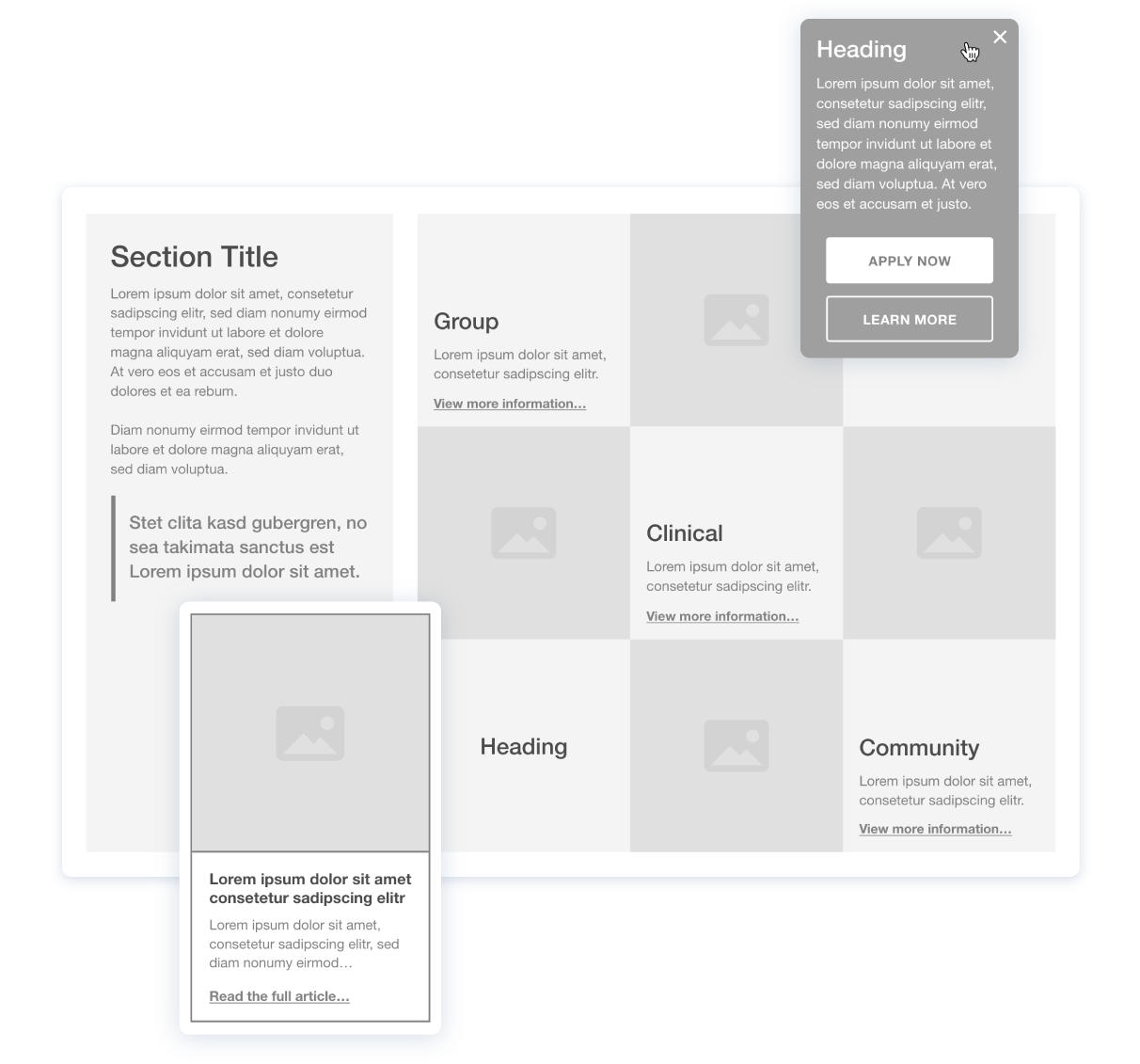
We were provided with basic layout structures from the client, which had to be translated to a full site design. So first we created the wireframes for the main pages on both mobile and desktop devices where all text, buttons, navigation elements, and placement of imagery had to be carefully considered for accessibility. The layout was then evaluated together with the client and iterated where needed.
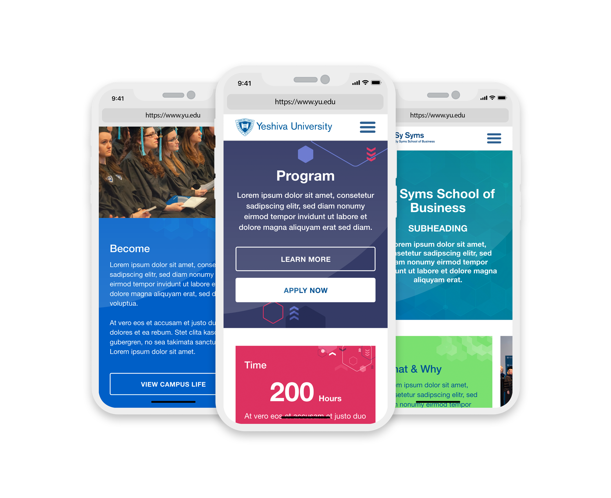
Once the wireframes were approved, the next step was to style the design and create supporting imagery for the schools. Each had a different feel that had to be visually communicated and applied. As the images were designed, we ensured they fully complied with web accessibility standards, since many of them had to be used as background images where text would be applied. Thus colours, contrast and layout of elements were evaluated before being added to the design.
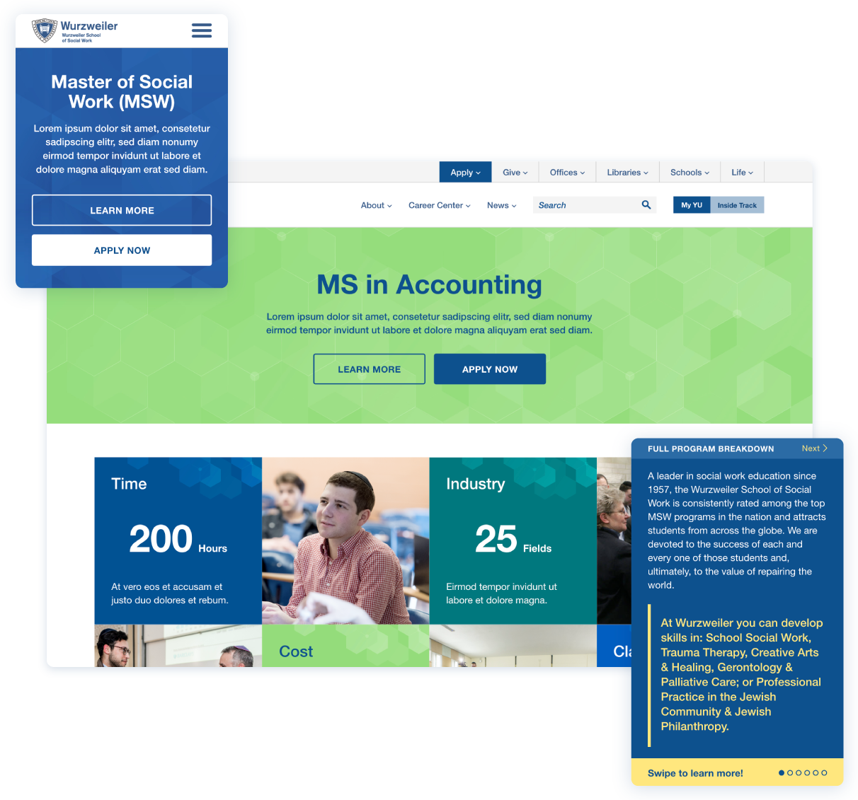
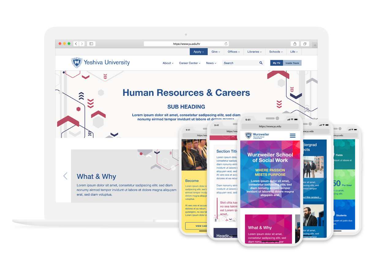
The finalized designs were given to the development team working on Yeshiva University’s website to implement. After the designs were applied, the website was easier to navigate & understand, call to action buttons were placed in areas where they are easy to see, and most importantly, the site as a whole was US accessibility compliant.
Visit website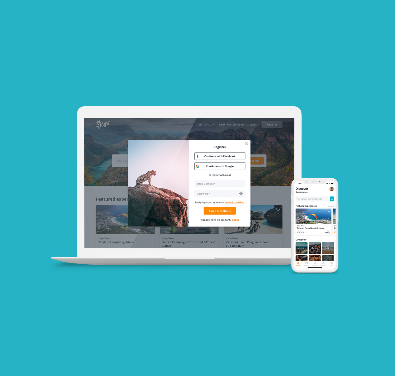
SJUP is the brainchild of Konrad (Kappie) Steyn and Malcolm Mostert. They have both been in the...
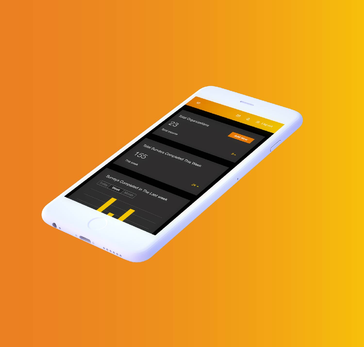
Temporall is a real-time enterprise culture analytics platform. It utilises proprietary algorithms and machine learning technology, designed...
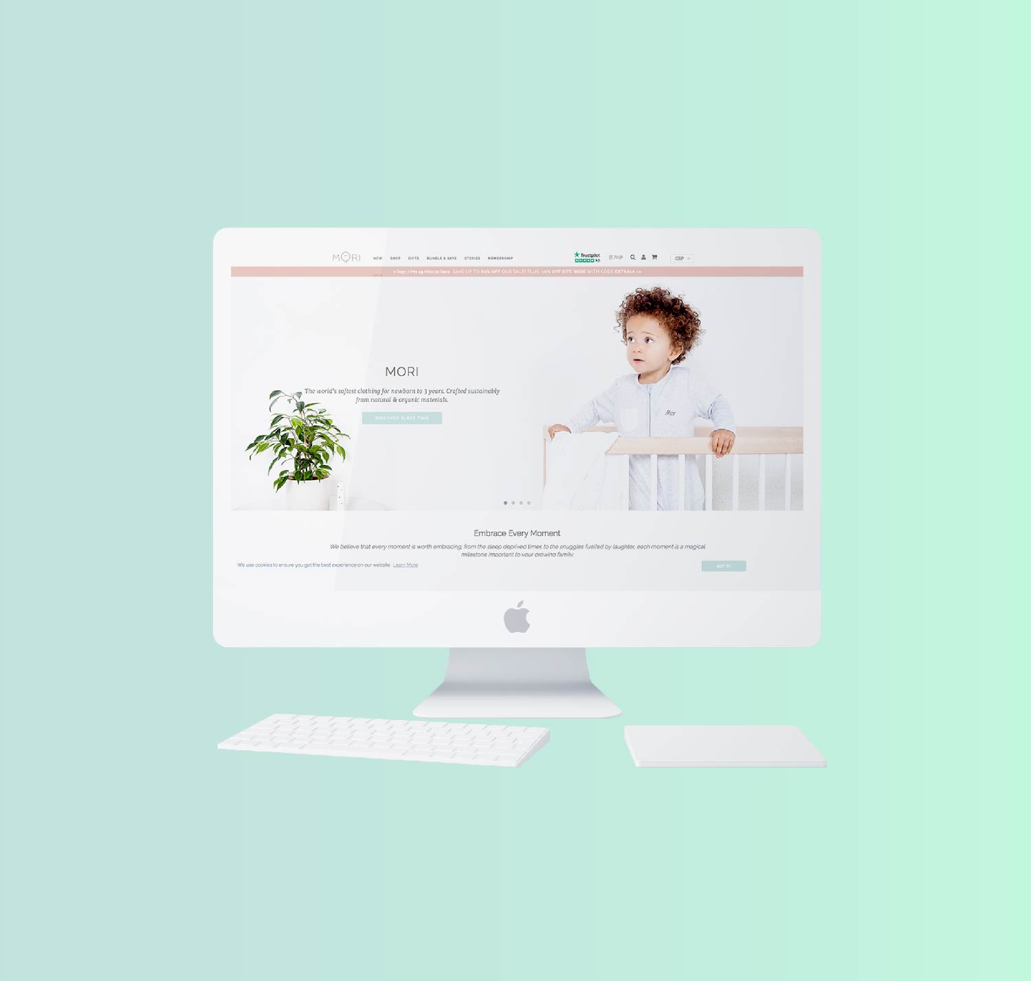
Part of 500 Startups’ 17th batch and winner of the Silicon Valley G-Startup Global Finals, MORI is...

What are you waiting for?
Let us help you turn your vision into a reality.